In this article, we’ll share with you how we set a goal to increase team performance by improving the feedback sharing and how Design Sprint helped us achieve this goal. As a result, we’ve prototyped a user-friendly app and collected positive reviews about it.
Intro
We at Uptech are excited about building cool products that users love, products that are featured in the App Store and Google Play, that win awards and make the world a better place (seriously). In late 2018 we understood that such approach as Design Sprint would help us a lot to deliver even better products for our clients, thus we decided to conduct such Sprints on our side. In this article, we’ll share with you the process, results, and insights from the Design Sprint conducted at Uptech.
Wait, but what is the Design Sprint 2.0?
The Design Sprint is a five-day process for answering critical business questions through design, prototyping and testing ideas with customers. The Design Sprint works for rapidly solving big challenges, creating new products, or improving existing ones. The process was developed by Jake Knapp, John Zeratsky and Braden Kowitz at Google Ventures and described in the book, “Sprint”. Companies such as Google, Uber, Slack, Lego and many more are using Design Sprints to successfully solve their big problems.
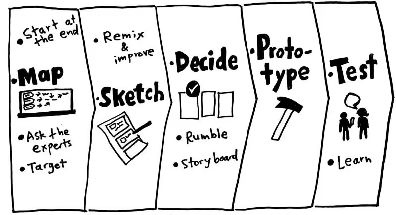
Design Sprint 2.0 is an updated 4-day process, developed at AJ&Smart. They took the original Design Sprint principles and optimized the original process so that instead of 5 days it takes 4. We at Uptech took their online Masterclass about the Design Sprint 2.0, read half the internet about “Sprints” and practiced Sprints inside the team to learn how to conduct them effectively (see links below).
Check out more about our UI/UX Development Services.
Preparation — process, idea, team, tools
In order to conduct the Design Sprint effectively, and not just have a fun time, you need to prepare carefully.
Process. First of all, you need to know all the step-by-step process of all the 4 days. We read the “Sprint” book (obviously). In addition, we used the checklist from AJ&Smart and watched their YouTube videos to know all the tips and tricks of each exercise.
Idea. An important part is also to select the right idea or problem to challenge during the Sprint. It should be big enough to be worth a group of people working on it 4 days non-stop. But not too big to be prototyped in 1 day (for example, “Making humans a multiplanetary species” is probably only for Elon-20-years-Sprint).
There’s never a problem with new ideas at Uptech, we even keep track of them internally, not to forget. In order to select the one for the Sprint, we conducted a small workshop, during which we voted for the most interesting for us. And we decided to focus our efforts on how to motivate team members to leave regular constructive feedback to each other. This is a problem that we faced ourselves and are very motivated to solve it. We would be users of such product by ourselves. More about it below.
Team. The following team members took part in the Design Sprint:
- Andriy Bas — Facilitator and host
- Dima Domashenko — Designer, Decision Maker
- Dima Kovalenko — Project Manager and Business expert
- Oleh Kryvytskyi — Designer
- Halyna Halkina — Android Developer
- Nick Melnyk — Designer
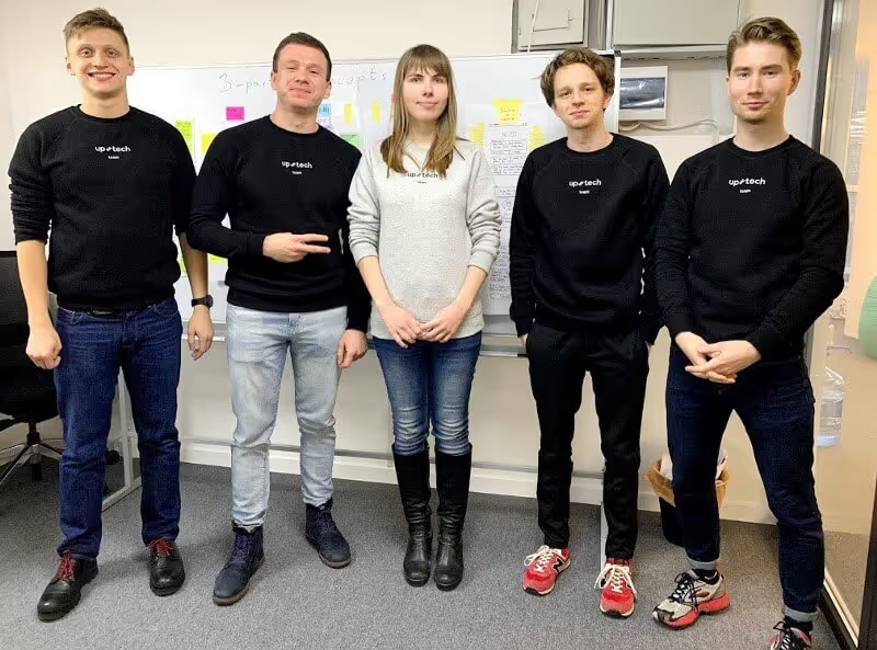
An important part of gathering the right team is to invite different team members that could look at the problem from different sides: from design, development, marketing, sales, business, etc.
The team should free up their schedule for the entire time of the Design Sprint. So that they can focus 100% on the problem, and not be distracted with other tasks.
Tools. Before the Sprint you need to do quite a lot of preparation. Booked quiet meeting room, post-it notes, sticky notes, dots, whiteboards, paper, markers, snacks… All the list see here.

Day 0 — before the Sprint
Before the Sprint we did quick market research about the competitors (such as 15Five, Lattice, CultureAmp, etc.) and prepared a list of pros and cons of the existing solutions. Some of the solutions we tested by ourselves. That way we knew the field very well and were prepared to challenge it.
Day 1 — Define the Challenge and Produce Solutions
The goal of the first day is to specify what exactly challenge we’re facing and produce several solutions for it.
Expert interviews and HMW questions
We started with the expert interviews. Since we ourselves are users of the solution that we were going to design, we decided to focus on our own company. As experts, people who are in the field and understand the problem, we invited our 2 team members. Plus, we interviewed Dima D. and Dima K. as experts (sprint team members). We used the Nielsen Norman Group guide to conduct the interviews in the right way.
While the experts talked, the rest of the team recorded the “How Might We…” (HMW) questions. The goal of this exercise is to write down all the insights and problems that experts share. After the categorization and voting, we narrowed down to 7 most important HMW questions. Among them:
- HMW remove the effort & share feedback on demand in less than 10 seconds?
- HMW remove fear, blockers, discomfort to share feedback?
- HMW encourage feedback sharing culture?
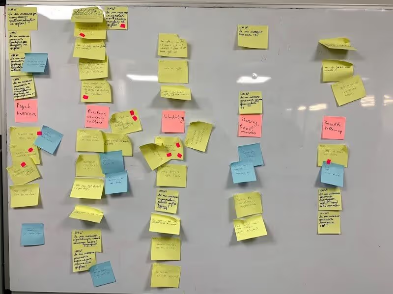
Long-term goal
After brainstorming and voting, The 2-year goal we specified as: Each interaction in the team is followed with the feedback.
And to measure the goal:
- 10% of the team members participate daily
- less than 1 day passes form the interaction and the feedback
Sprint Questions
Sprint questions are like HMW questions, but they are more specific and designed to help identify the obstacles that might prevent us from reaching our 2-years goal.
Our Sprint questions were:
- Can we remove the emotional blockers and psychological barriers in the team?
- Can we make the feedback sharing simpler so that team members can share it on the spot?
- Can we develop an interaction model that would allow gathering feedback from 10% of the team members daily?
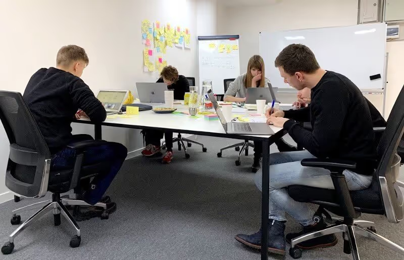
[photo 04. Working on the Sprint Questions]
Map
We drew the map to help us visualize the flow of the user and have a full picture of how they interact. We split it into several important steps: having an interaction, deciding to request or share the feedback (where the user solves important psychological barrier), preparing and sharing (or receiving the feedback).
As the target area, we selected the feedback sharing process itself, so that we’ll focus on producing the tool during the following days. We made an assumption that the cultural and psychological barrier is already solved, otherwise, we’d need a whole new Sprint to address it. 😉
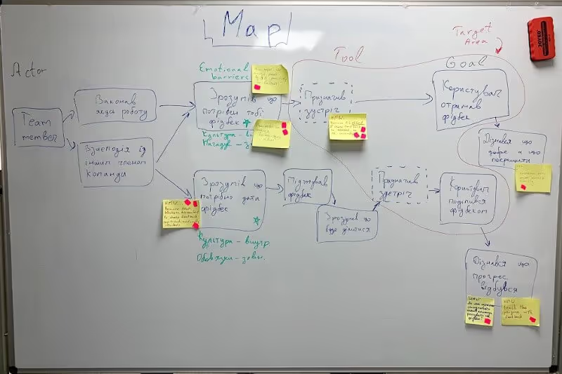
Lightning Demos
After the dinner, we did the Lightning Demos. The goal of this exercise is to generate a pool of ideas that the team will later use to produce their solutions. Since we all know that almost any new idea is just a new combination of a few existing ideas. The team did good research and introduced the examples of how other products work: Monobank, Uber, iPhone notifications, Google Calendar, Lattice, 15Five, Ashan, Slack were just a few examples.
4-part Sketching
The first day ends with generating the solutions. It’s done in 4 steps. The first three of them — Note taking, Doodling and Crazy 8s — are warm-up exercises, they are designed to flex the visual communication muscles of the team. The Sketching was done great, and the team members came up with decent concepts. Each of the concepts consisted of the 3 main steps, had a catchy title and self-explanatory text. It’s important to keep the concepts anonymous so that the team members are not biased the next day when they vote.
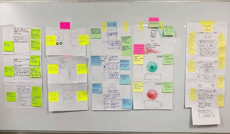
Day 2 — Vote for the Solutions and Create Storyboard
The goal of the second day is to select the solution the team will test and fill all the necessary details for it with the Storyboard.
Solution presentation
We started with the Art Gallery and Heat Map Voting. Each team member received 60 red dots, walked around the room and placed the dots next to the ideas or features (s)he liked the most. In the end, we had many red areas.
Next, the Facilitator presented the concept to all the team. The idea is that not the author of the concept presents the idea, to make this process anonymous, and also make sure that all the team members understood the concept.
A good approach is at the end of each concept presentation to ask “Did anyone place a dot at this concept for the idea or feature that I didn’t mention?”. And indeed, a few times it appeared that the team members noticed some ideas that the Facilitator missed. Such an approach brings all the team members on the same page.
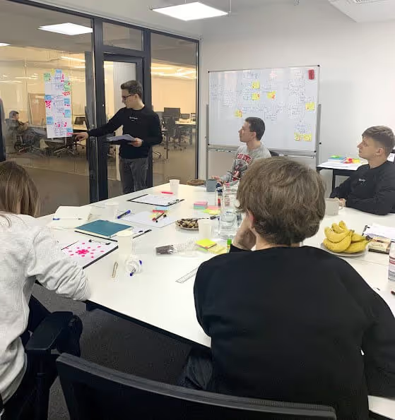
Voting
Then the team during the Straw Poll voting (synchronous voting) placed their bets for the best concept. All 4 team members place bets on a single concept. The decider later picked this concept as well.
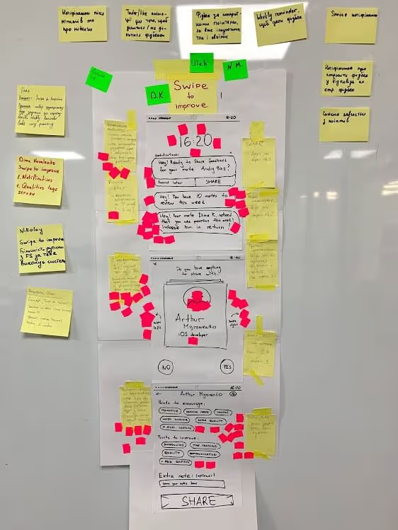
The key idea of this simple and well-thought concept was to start with notifications that would prompt users to give feedback. And the app would suggest each user a stack of his team members that he could share the feedback with. And the user should swipe them left to skip, or right to give the feedback (just like Tinder-swiping). And the steps to leave the feedback were also very smart and simple. Plus the system allowed adding your own qualities to the system so that it automatically adjusted to the team needs.
User Test Flow
During the User Test Flow exercise, each team member wrote the 6 steps that the app users need to perform from the entry point until reaching their goal of sharing the feedback. We presented and voted for the best User Test Flow. This step is designed to make the next step easier and faster.

Storyboard
The most important task of the day was to fill in the Storyboard. The idea of the Storyboard is to sketch out an entire journey through our product with enough detail so that everybody is aligned on what goes into the prototype. After the Storyboard, there should be no open questions about the concept, so that during the next day the team can focus on prototyping, and not discussing again. No brand new ideas should be added at this point (which is hard). At the same time, we should avoid unnecessary efforts and re-use as many materials as possible.
We placed the user steps into the 8 cells and started drawing the concept screens. We decided not to re-use our concepts but to re-draw them to update a few steps. We spent 3 hours on the Storyboard, brainstormed different solutions and approaches. And at the end designed the whole 11 screens (instead of the expected 8). But some screens were very simple.

Day 3 — Prototype
The goal of this day is to build a prototype that can validate our solution.
Paper prototype
The paper prototype is the simplest possible approach to test almost any app. We split the work between all the team members, and within 1 hour, the paper prototype was ready. It gave us a feeling of teamwork and a sense of achievement. We tested it 2 times between the design sprint team members — Andriy and Nick, and with one external user — Olena. This quick testing gave a feeling of confidence before the next day.
While testing, we recorded a list of improvements for the paper prototype and places where the users were confused. We put that improvement on the sticky notes and placed them on the Storyboard to the respective parts. After the dot voting round, we selected 4 most important ones and improved the Storyboard based on the suggestions.

Digital prototype
Since we already had the detailed Storyboard, the paper prototype and 3 designers in the team, it took us only about 1 hour to create a digital prototype in Figma, working simultaneously.

Recruit and schedule user tests
During the day, Dima was working on scheduling the user interviews, preparing the interview script. Since we designed the tool for internal use mainly, we also decided to invite 4 internal team members and 2 external. For recruiting external user we made a Facebook post (since we had a good network of the potential users of the app). A lot of users volunteered to help with testing and we scheduled the calls with the 2 most experienced ones. Even though it’s recommended to schedule 5 interviews, we decided to go with 6 to receive valuable insights from more people.
Read more about how we conduct Usability Testing at Uptech
Day 4 — Test the prototype with users
The goal of the 4th day is to conduct the user testing of the prototype, collect the feedback and make a decision about the next steps about the product.
Interviews
We arrived at 10 AM to make the final tests and preparation before the interviews. We drew a big table on the whiteboard with the name of all interviewers and the list of features about which we wanted to receive the feedback. The first interview was scheduled at 11 AM. After that, we took 2 hours for the fixes/improvements in case any issues with our approach or the prototype.
The first interview indeed helped us understand and get used to the process better, and set up proper video recording.

As for the interview process itself, we tweaked it a bit to our needs. Instead of the notetaker taking notes immediately and recording pros/cons during the interview, all the team took notes and recorded important points. Then after the interview, we collected our notes together to create the combined stickers of pros and cons. On the red stickers, we wrote points to improve, on the green — what users liked, on the blue — general comments/insights. It gave the team the ability to make sure all the ideas were mentioned and that the team is on the same page.

An important lesson that we learned is that conducting user interviews is hard. And 6 interviews in 1 day is too much, 5 is enough. At the end of the day, the team was tired.
Day 5 — after the Design Sprint
The next week after the Design Sprint we grouped the user feedback into the categories / common features. Then we took the dots and voted for the most important changes to implement (for red or blue stickers).
We ended up with the 14 features to implement. We draw an Impact / Effort scale and placed the cards on the scale depending on how hard they are to implement and how much impact they bring to the app. And at the end, we circled the group of the cards from the top left corner (lowest effort, biggest impact).
These are the features that we’ll focus on in the next update for this app. We decided to place this app on hold and validate several more ideas, and get back to the concept in a few months before moving to the development.
The digitalized User Testing board and the Impact / Scale board you can view here.
On this note, the Design Sprint is successfully finished!


Summary
Our team loved the Design Sprint process. Almost any product or design team talks about Design Thinking and other trendy topics. But few know how to apply them on real projects. And the Design Sprint is a very practical step-by-step process to apply the Design Thinking principles to solve big challenges and create new products. It creates the right atmosphere in the team to unleash creative thinking to problem-solving from each team member.
We are satisfied with the approach to developing the product and with the final result.
If your team needs to solve big challenges — the Design Sprint is the right choice!
Contact Uptech if you want us to conduct the Design Sprint for your problem or idea! We love bringing new great products to life! 🚀
Useful links:
- Design Better links: https://www.designbetter.co/enterprise-design-sprints
- Jake Knapp blog: https://medium.com/@jakek
- AJ&Smart blog: https://blog.ajsmart.com/
- “Design Sprint” book by Richard Banfield: http://www.designsprintbook.com/
- How to validate your app idea without development


