In July 2020, we began our partnership with Holovis to create a UI redesign for their project Crowd Solo – a social-distancing and facility maintenance software application designed to help amusement parks reopen safely in the wake of Covid-19. The client already came up with the app user flow and initial designs that he wasn’t happy with. Our goal was to create an expressive UI/UX for the app, using a product development approach.
The following UI case study reveals what actions steps we have taken working on the CrowdSolo redesign and shows a vivid example of how the product approach helped us to achieve a lively and humane UI/UX design for the app.
CrowdSolo UI Redesign: Project Challenges
Working on this UI case study, we kept in mind the central idea of the app – allowing users to find out information about attractions and safely book tickets for themselves and their friends. In our turn, we had to create a smooth and app’s light UI/UI according to the brand style. To that end, we needed to complete the following tasks:
- Conduct a user research;
- Create a vibrant and simple app’s UI/UX for the existing app flow;
- Set up a color palette aligned with the client’s vision;
- Make lively illustrations for the app features;
- Create minimalistic UI elements;
- Test the app’s user flow to see if the UI is easy to use.
.avif)
Our Solution
The first thing to mention in this UI case study was conduct user research to find out the user pains and needs. The research results helped us to create the design templates and test them with users. Given the user feedback and comments, we managed to build a rich UI that illuminates joy and delight. So here’s what we did.
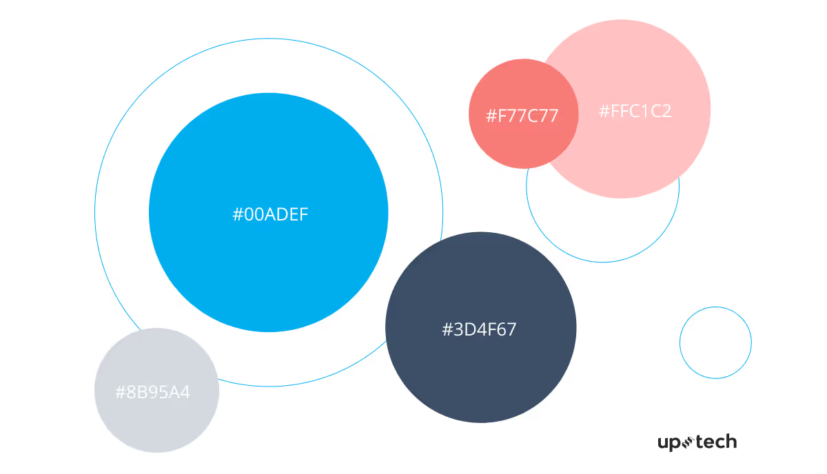
Colors
The client chose blue as the brand color. We used collar and pink for contrasting accents and added some shades for the text and UI elements.
Typography
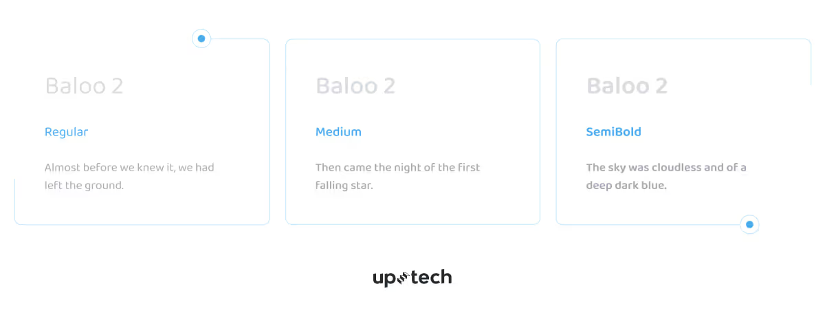
We chose playful and spurless fonts to convey the entertaining spirit of amusement parks.
UI elements
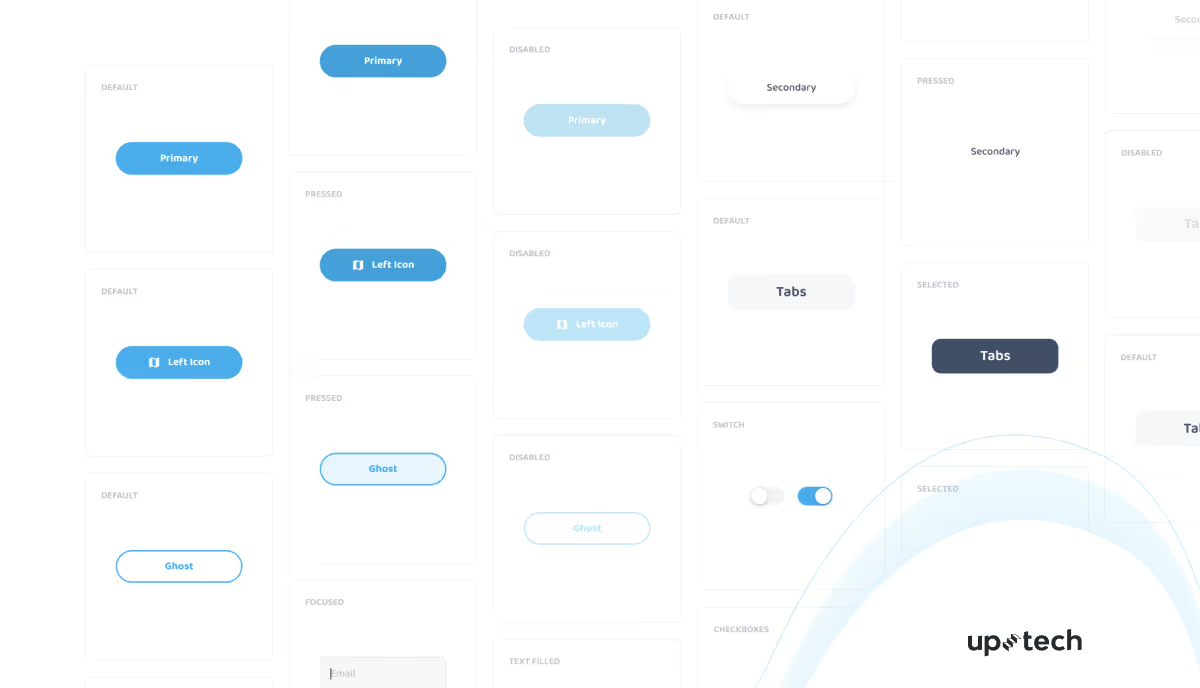
The UI elements maintain the app design's simplicity, with blue as a dominant color in varying shades.
Find Out Why You Should Consider Hiring UX Designers For Your Startup
Illustrations
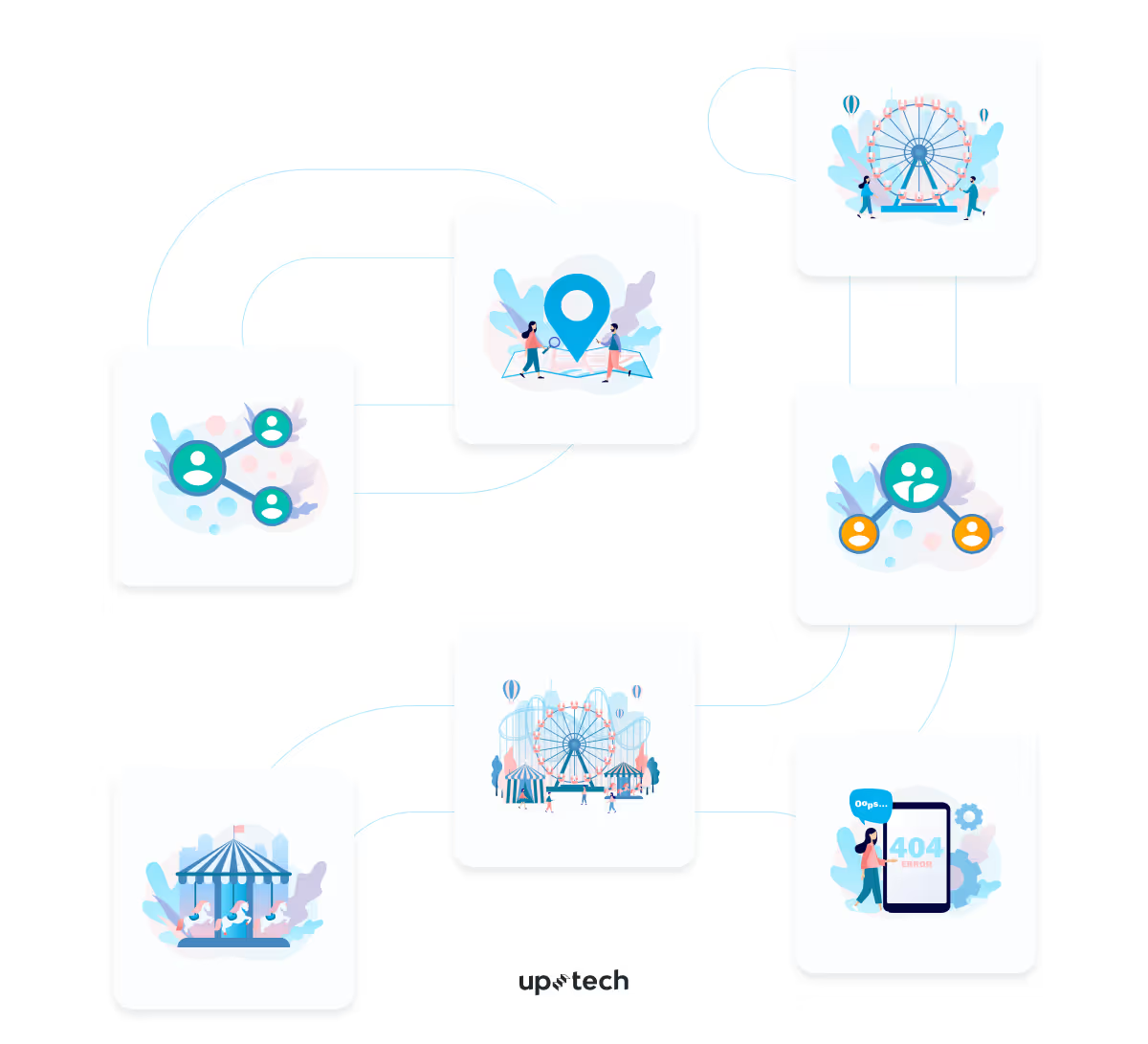
To convey the app’s primary functions, we made lively illustrations.
App screens
Account creation
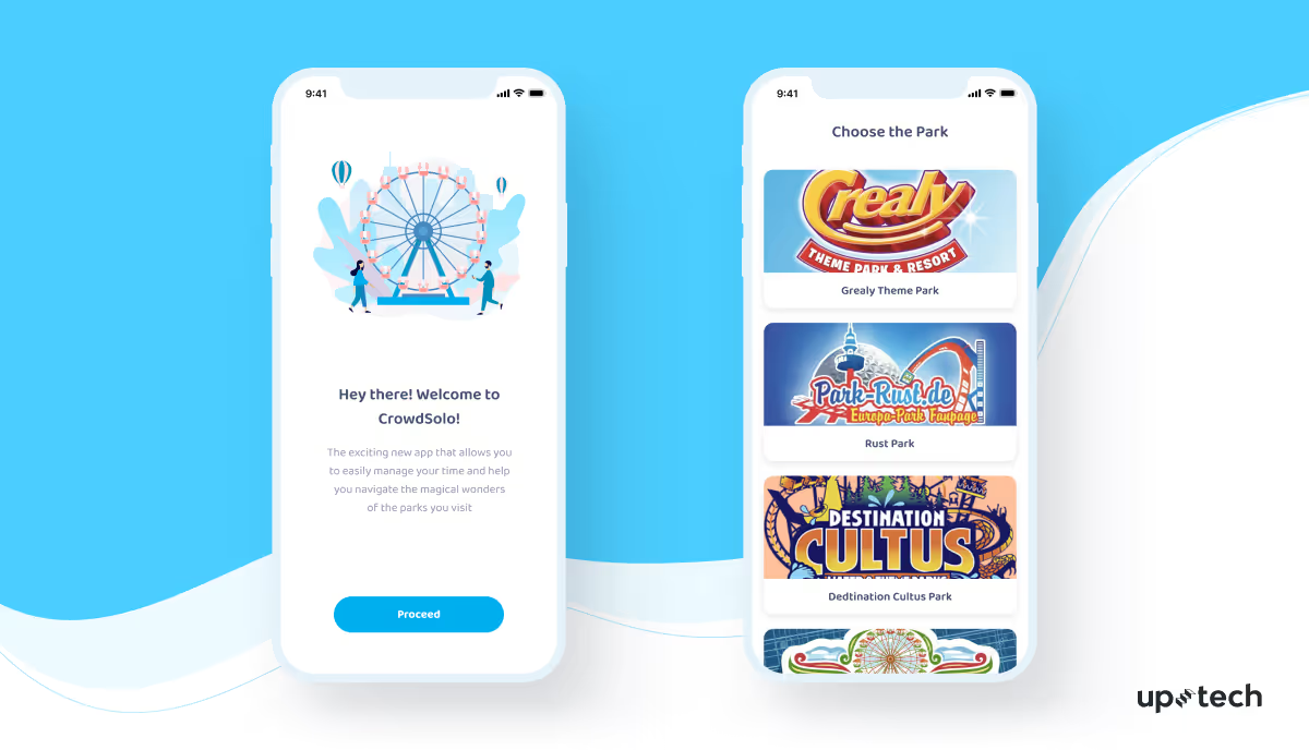
When signing up, visitors can choose their preferences. The same account will work at multiple locations when using the CrowdSolo app.

.png)
Location
Visitors use their device’s GPS settings to indicate the current destination once they have arrived at the park. Thus, the app makes sure visitors can log in and book slots within the park’s territory only.
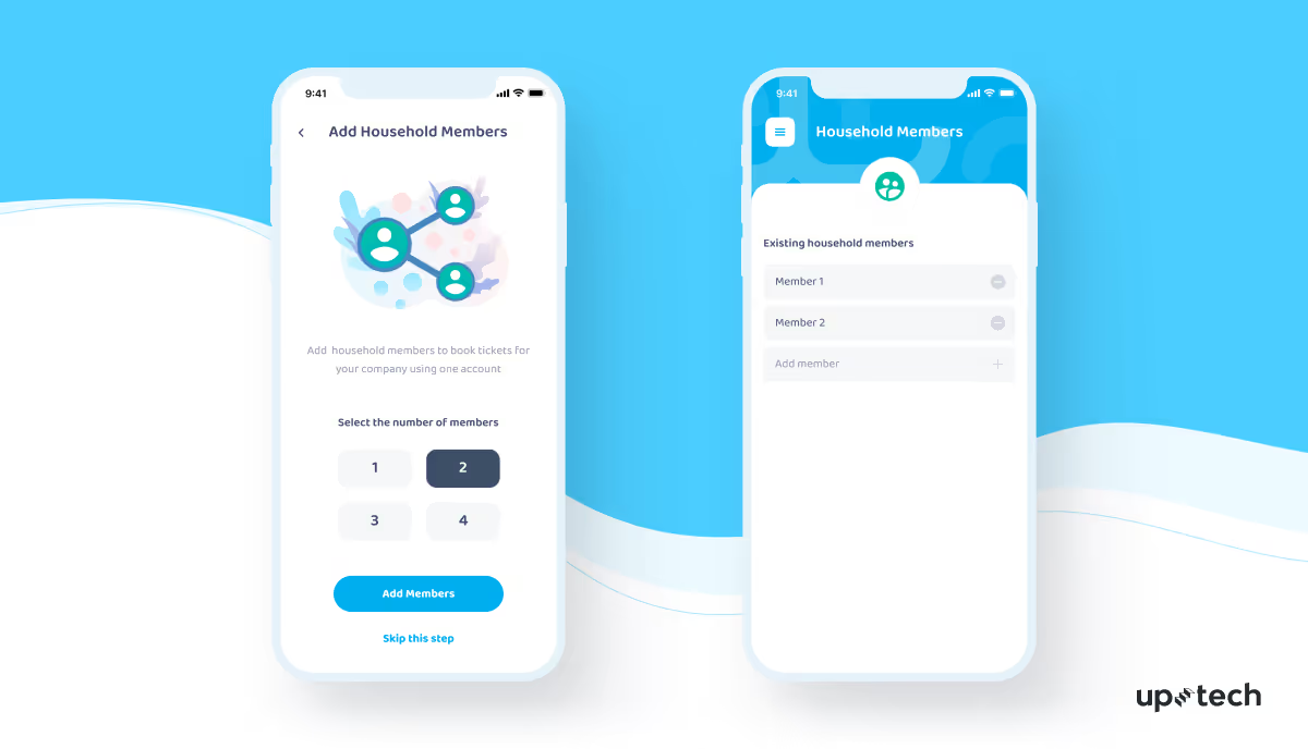
Add a member
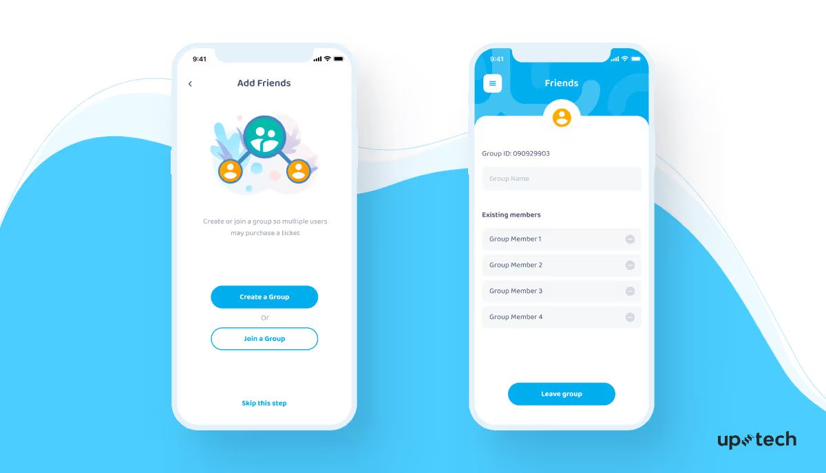
Visitors who do not have mobile phones can join their parents' or friends' profiles to make suitable reservations for everyone throughout the day.
Create a Group
Users can link up with the rest of their mobile active party so multiple users can book experiences together.
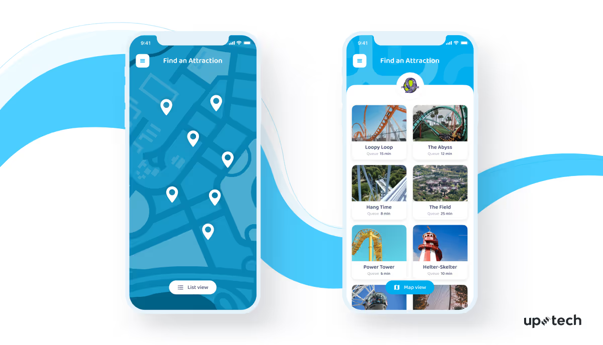
Find Attractions
Visitors indicate their want-to-visit list of experiences using either the map or a list view. This eliminates the need for any physical queues, which enhances safety and improves visitors' experience.
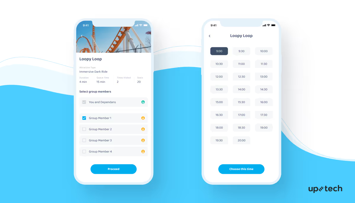
Book a Time
Visitors can choose from various available options the time slots that match their group size and preferences.
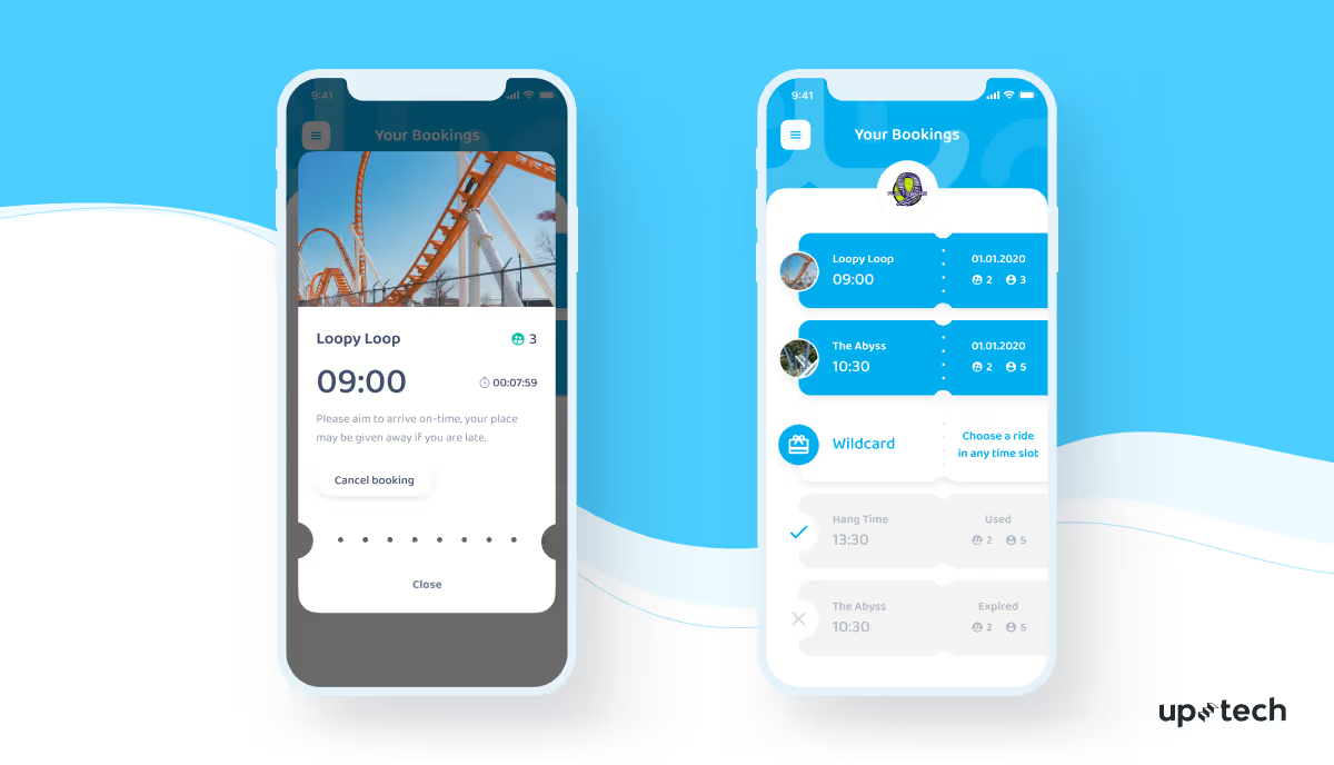
Present Your Ticket
Visitors show their digital tickets before entering the amusement site and are reminded to arrive on time.
Check out our case study for Golf App
CrowdSolo UI Redesign Case Study: Conclusion
Even though the task was about the UI design, we used a product-development approach to develop a better result. We are proud of how smooth, light-weight, and expressive this UI design is. We are always eager for new challenges! As a product-development studio, Uptech helps clients to put their ideas into life and build better products. Contact our managers and make your dream a reality with us.

