Have you ever noticed how some things designed to make our lives easier puzzle it even more? For example, the whole financial system. Depositing in a brick-and-mortar bank can take up to halves of our daytime! Quite a big deal for a simple operation, isn’t it?
Luckily, fintech is a real game-changer that aims to humanize the interaction between people and banks. Today fintech is one of the most widely used technologies, surpassing video streaming (78%) and social media (72%).
Yet, making a smooth UX design for a fintech design that will talk to such broad audiences as banks have, is a hell of a challenge!
In this article, I want to share how exactly UX/UI design can make a difference in financial software development. I will also highlight tips and tricks on humanizing the UX/UI design of a fintech app so that it helps users achieve their financial goals.
Let’s dig right in!
What is UX/UI Design?
The first thing we imagine when mentioning app design is the icons, buttons, and animations in any app you find on your phone.
And you will be right! App design is the internal interface of an app, consisting of different visual elements, like icons or buttons. Yet, this is only the UI (user experience) part.

Behind the visual facade stands a complex string of precesses like prototypes, user interviews, research, and testing. Thanks to these procedures, designers can provide the user experience (UX) that allows the user to accomplish their goals flawlessly. All these processes are made to ensure that the user gets the experience they deserve for covering their needs.
Unfortunately, only 55% of companies currently conduct usability testing. And even more unluckily is that 70% of online businesses failures occur because of bad UX usability.
Read more about the UI and UX in our article How To Design An App That Reaches For Your Business Goals?
Flawless Fintech UX/UI Design: Main Characteristics
How to make a smooth UX/UI design in fintech? Well, that’s pretty challenging. The design team’s primary purpose here is to make complicated things simple and clear to a broad audience. Making complex things simple is difficult.

Let’s look at each of these principles and see how we can achieve them.
Great UX/UI Design in Fintech = Trust
Trust is the natural feeling of a user that their data, information, or funds will not be misused or abused. While trust is essential in interaction in any app, in fintech, it deserves special attention. By trusting their funds and documents, the users make a fintech app a part of their daily life. Building a solid UI/UX design is one of the main ways to build trust with the user.
Quick tips:
In human relationships trust is built in a dialogue. The same works for a fintech app: you need to talk to your user humanely, in the same language as his language. Here is what you can do:
- “Speak” like a human (try “Hi! How are you?” instead of “You entered the system”);
- Add emotions (be optimistic and easy-going, as far as it does not affect the users’ decision-making);
- Visualize data: use animated graphics and illustrations to show statistics, diagrams, and numbers.
UX/UI Design in Fintech = Transparency
Transparency is another crucial feature of a fintech app’s design. To achieve it, you need to ensure there are no blind spots or hidden meanings in the copy.
Quick tips:
- Explain why (make sure the user understands why they have to submit their identity documents, or pay a commission);
- Make a glossary of financial terms (when you cannot avoid the terminology, make sure it is clear);
- If there is anything wrong during the process, do not frighten the user with an error screen. Instead, explain what happened and how to do things right.
Great UX/UI in Fintech = Simplicity
Unfortunately, many great beginnings in life break down when things become too complicated.
Whether it is a lack of persistence or laziness to blame, you need to deal with the fact – people do not like complicated things.
Talking about complicated things, the word “financial” now has a negative connotation of being something complex, challenging, and not available to an average person.
So your purpose as a fintech app cofounder is to ensure your fintech UX design is simple enough for a broad audience.
Quick tips:
- Break down complicated stuff (lead your user to their goal step by step – for example, do not be afraid to add more screens than planned);
- Give your users clear hints to help them. For example, explain where they can find the security number.

Building UX/UI Design: Legal Restrictions
Financial sector is one of the most legally regulated industries. As a fintech service provider, you have to make it comfortable for users to go through the lengthy processes of:
- Know Your User (KYC) authentication. In simpler words, this procedure makes sure the customer is who they say they are. It always involves the submission of ID documentation.
- Anti-Money-Laundering (AML) checks. These procedures are made to make sure the user’s account is not related to illegal activities, terrorism, or fraud.

In terms of UX/UI fintech design, you need to lead your user through these procedures step-by-step, helping them out at each step.
Here are 3 tips on how you can do that:
- Break up the processes into smaller steps;
- Help the user at each step: explain, give definitions, and support 24/7;
- Provide enough information: explain to the user that these procedures are entirely safe, and the app will not use data in any fraudulent way.
The thing to remember: You can make all the possible efforts to protect users’ data from leakage or misuse. In your UX you can also remind users to do what depends on them – keep digital hygiene and be attentive when submitting their card requisites to service providers.
5 Things That Will Make Your Fintech App’s UI/UX Better
There are a variety of ways in which you can improve your fintech app’s design. Here are a few of them:
Onboarding screens
Onboarding is an introductory fintech app that usually takes place before the registration process. In the onboarding part, you can gradually introduce the functionality of the app to the user and give tips on how to effectively use it. Things to keep in mind while building onboarding screens:
- Keep it simple and fun: use animations, copy, tooltips and make them clear, concise, and engaging. Statistics show that 13% of users changed to another service provider as a result of a long onboarding process.
- Follow the user's scenario: remember that onboarding is the user’s first step in the app flow. So do not overload them with info, give it gradually;
- Make it one at a time: try to put no more than one function per screen.
Read more about onboarding best practices in our article How to Build UX Onboarding Screens that Make a User Stay with Your App.
Gamification
One of the ways to turn banking from a boring routine to an entertaining process is gamification. By gamification, we mean introducing elements of games and competition into the app. For example, you can give your users awards and badges once they spend a certain amount on health services. These elements would add more gamification to your app:
- Challenges and streaks;
- Progress bars;
- Badges and stickers;
- Leadership boards;
- Rewards.
Accuracy in Design
The best way to build a practical design is to create a design that behaves the way users expect it to. Doing an accurate design is possible by following:
- Official operating system user interface style guides (for example, Apple Human Interface Guidelines or Android Design Guidelines);
- Inclusivity design standards for design say that the copy should be contrasted and checked, the colors should be accessible to people with daltonism, and the size should make the text readable for people with different levels of sight. Also, the VoiceOver functionality can be very helpful for people with vision disabilities.
Data Visualization
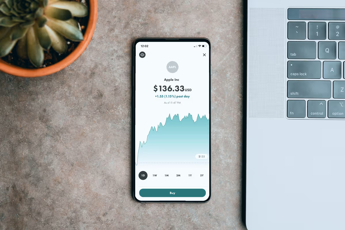
Fintech apps deal with a lot of numbers, statistics, and diagrams in their interface. Yet, not all people are financiers (actually the majority of them are not). So to make the numbers bear meaning you need to put a story behind them. The best way to do it is to turn the numbers into visuals.
Protip: Many fintech apps take a step further and introduce Machine Learning algorithms into their service. For example, you can use MA to predict the users’ spending over time using their current patterns and visualize these predictions.
Design team of professionals
To build a UX fintech design that will speak the users’ language, you need to listen to the users and ask the right questions. For that, you need a team of designers, who can do more than providing visuals.
You need professionals, experienced in interviewing users, running usability tests, and transferring these results into a user-oriented UX design for your fintech app.
Uptech design team carries out a Discovery stage aimed to make a user-centered design, and consisting of:
- Product Development Workshop;
- User Research and Interviews;
- Usability Testing.
Only after talking to the users and analyzing their opinions, can our designers offer a solution that matches users’ needs and falls in line with their lives.
Want to know more about UX design that matches users' needs? Contact us and we will discuss the UX design for your fintech app.

Conclusion
Building an effective UX/UI design for your fintech app is essential. In fintech, there are some moments where you need to pay special attention: trust, transparency, and simplicity. Also, many instruments to improve your app depending on your targeted audience.
The Uptech design team never ignores users' needs in their work and speaks one language with them. Contact us, and we can discuss our UI/UX design services.


