Rather than aiming for perfection, it is more important to focus on continuous improvement for user experience (UX) for an existing product. In this article, we’ll be exploring a heuristic evaluation example, particularly the exact process that we’re using to improve apps.
UX review is important to ensure that you’re delivering the right solution that resonates with the audience. It ought to be carried out in products and services offered to ensure that customers are getting the best out of what your company offers.
Rather than glossing through the theories, we’re going to show how Heuristic evaluation is applied in a real example: The Chase Mobile Banking App.
.avif)
Chase For Business App Overview
The Chase business app allows users to easily connect and utilize the banking accounts and services provided by the JPMorgan Chase Banks. The Chase app offers the same financing features as the Chase.com website, including security, reports, and the ease of sending money.
Users who already have a Chase.com account can download the app and get started with the same credential. Alternatively, they can create a new account from the app itself.
Our UX Review Process
Now, let’s get started on the UX review process of the Chase business app.
Set objectives
Before starting the Heuristic evaluation for UX review, it is essential to establish the objectives of doing so. Ultimately, the process is intended to chart a clear actionable path to improve the design. The objectives may differ according to apps and organizations.
For example, you may want to review an app to find out ways to increase sign-up rates.
In our case, we’re reviewing the Chase app to improve the app’s user flow and streamline the user experience.

Study behavior flows
User behavior reveals a great deal about what’s working or lacking in an app. It provides insights into issues like high user drop offs, particularly where and why it happens.
Our team uses a few methods to study behavior flows on apps. We use proto personas (as we have only assumptions, that we need to validate) to understand user needs and build empathy. We create an interactive user experience by combining the documented user journey with business and user objectives.
Here’s how our proto persona looks like
%2520(1).avif)
An example of Customer Journey Map
%2520(1).avif)
In order to get a deeper insight into users’ needs and validate our assumptions, we also conduct interviews.
The Chase App Heuristic Evaluation Example
Heuristic evaluation is a popular method to analyze user experience in a finished product. It is based on a broad set of guidelines where a number of criteria are manually evaluated. The goal of the Heuristic evaluation is to pinpoint problems in a product and offer the right solutions.
In our review process of the Chase app, we’re going to use Jakob Nielsen's 10 heuristics that are proven to be reliable in UX evaluation.
Let’s go through each criterion with accompanying analysis, problems, and solutions for the existing app.
1. Visibility of system status
Users ought to always be aware of what they are doing in an app, particularly one that involves financial transactions.
Problem: No obvious elements (deposit)
Task: Put money on deposit
Issue: Elements with the camera icon doesn’t explain exactly what the users need to do.
Recommendation: Add a description or visually display what needs to be photographed.
.avif)
.avif)
Good Points: Progress bar on the signup screen.
2. Match between system and the real world
Apps are created by developers who are familiar with programming terminology. However, users appreciate the information presented in languages and terms they are familiar with. The disparity in both leads to a bad user experience.
Problem #1: The icon doesn’t display information about opening an account.
Task: Open an account.
Issue: The icon on the button doesn’t correspond to the button’s function.
Recommendation: Replace the icon with one that associates with a bank account.
Problem #2: The support button lacks a descriptive label.
Task: Contact support.
Issue: The button’s name isn’t informative enough. It doesn’t imply that the button is used to contact the support manager.
Recommendation: Replace the text on the button with ‘Contact Support”
Good points: It provides a convenient ATM search map.
3. User control and freedom
An app must anticipate unpredictability in user behavior. For example, the user may make mistakes and need to backtrace the navigational path. Or he/she needs to make corrections to inputs on the app.
Problem: No issues were detected.
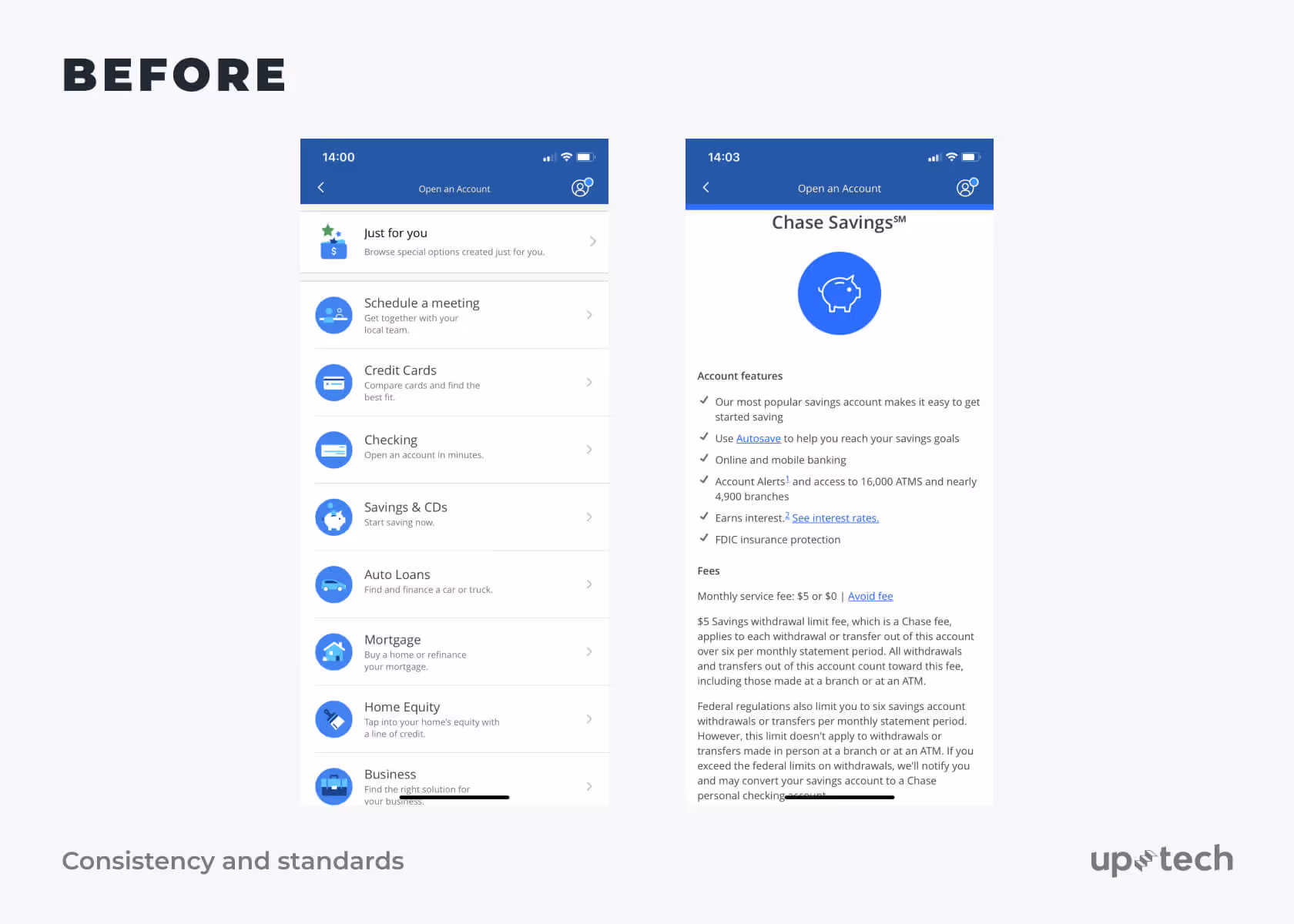
4. Consistency and standards
Users are bound by habit and it will be bad for UX if the app does not show consistency in terminology, layout, and behavior. An app could be confusing for users if it fails to maintain a standard operating convention.
Problem #1: Inconsistent icon style.
Task: Access bank accounts info.
Issue: The app icons are differing in style. There are at least 3 different types with mixed outlines, fills, and colors. Some icons point to the same action but are not uniformly designed on different screens.
Recommendation: Create a set of consistent icons for the Chase app.
.avif)
Problem #2: Navigational elements behave differently in different situations.
Task: Navigating the app
Issue: The navigational elements are not confined to a single predictable behavior. There are several types of drop-down and add buttons. At least 2 types of tabs are found in the app with one strikingly different from the generic background style.
Recommendation: Standardize the appearance and behavior of navigational elements.
Problem #3: Different styles for similar elements.
Task: Determine the visual composition of buttons and elements on the screen.
Issue: Too many font and button styles, including the placeholder for buttons.
Recommendation: Create a style and its variation for the same interface element.
.avif)
.avif)
Problem #4: Dropdowns look different in various scenarios.
Task: Redesign dropdown elements
Issue: There’s a lack of consistency with dropdown arrows and behaviors. It’s hard to anticipate the behavior of dropdowns as similar styles may result in different interaction behavior. Also, dropdowns that exhibit the same behavior sometimes have different colors.
Recommendation: Redesign dropdowns by making them visually consistent across similar types of interaction.
Problem #5: Inconsistent ‘More’ button behavior.
Task: Make the ‘More’ button consistent
Issue: The ‘More’ button opens different types of windows in different situations.
Recommendation: Review the information in the window and figure out how to make the style of the windows consistent throughout the app.
5. Error prevention
Users are bound to make mistakes and it is the onus of the app to detect and prevent them from happening. Verification checks and error prompts are good features to prevent the app from taking in erroneous inputs.
Problem: Users are only aware of errors after pressing the ‘Continue’ button. The Chase app lacks preemptive error prevention.
Task: Improve error prevention.
Issue: The app lacks preemptive error checks, which results in users spending more time correcting the mistakes and completing the form.
Recommendation: Add contextual field validation to check the information filled in spontaneously, and not after the user has submitted the form. Any input rules should be highlighted, whether they are fulfilled or not.
Good points: Field hints to make form-filling easier and confirmation of selection for clarity.
6. Recognition rather than recall
Any information and instruction deemed critical in using the app should be made visible to users. Users should not be burdened with memorizing the details as they navigate through the app. Such information should be visible, or easily accessible.
Problem: Title for ‘Account’
Task: Add navigation bar title
Issue: The navigation bar title is absent.
Recommendation: Review all pages to find out if the navigation bar title is missing elsewhere.
7. Flexibility and efficiency of use
Both novice and experienced users expect the app to be tailored to their preferences. Therefore, an app must allow personalization according to the user’s level of experience. For example, advanced features are hidden to prevent overwhelming novice users but accessible to experienced users.
Problem #1: Can’t copy an account number.
Task: Add the possibility to copy an account number.
Issue: It takes too much effort to copy an account number.
Recommendation: Enable account number copying by holding the account number for a few seconds until the message ‘Account number was copied’ is shown in a small text field.
%2520(1).avif)
.avif)
Problem #2: Button height is less than 40 pixels.
Task: Check the clickable button zone.
Issue: The existing button height is not optimized for mobile. It is too small for a ‘touch’ to be made comfortably on the screen.
Recommendation: Review button and touch target heights. Ensure that the touch target height is at least 48 pixels or more. A touch target of this size results in physical size of about 9mm regardless of screen size.
.avif)
.avif)
Problem #3: Overloaded FAQ without a search function.
Task: Improve user interaction with information on the screen.
Issue: There are too many topics in the FAQ and it overwhelms users without the presence of a search bar.
Recommendation: Segregate FAQ to related topics to ensure users spend less time finding the right solution. Allow users to navigate the FAQ by categories. It’s also a good idea to include a search bar, which lets users instantly locate a topic in the FAQ. Include a feedback form for users to suggest potential improvements.
.avif)
.avif)
Problem #4: Overloaded screens
Task: Improve user interaction with information on the screen.
Issue: A large number of paragraphs and nested sections results in a cluttered interface. This may lead to an unpleasant user experience, particularly for advanced users.
Recommendation:
Rethink sections and iterate on nesting information. Make on-screen navigation easier by adding sections. Transition to new screens and use overlays for separate contextual information.to reduce the burden on users.
Good Points
- A lot of useful information without logging in/signing up to the app.
- Easily-understandable navigation.
- Users can make common transactions in a few clicks.
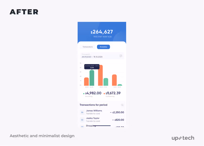
8. Aesthetic and minimalist design
Less is often more in an app design. Adding more information than required may overwhelm and confuse users. Instead, ask whether it is necessary before adding in elements, features, or information to the app. The app should be strikingly simple, yet allows users to easily achieve their purposes.
Problem #1: Not enough contrast between important elements and descriptions.
Task: Arrange and structure the information based on hierarchy and priority.
Issue: There is a lack of contrast between important graphics and texts. The poor choice of colors and typographies results in the failure of displaying the data vividly to the users.
Recommendation: Highlight the differences between primary and secondary information with the right contrast. Use the right color, size, and typography to display data unambiguously. Keep information simple and reduce unnecessary elements to simplify user navigation.
Problem #2: Unnecessary profile on the internal screen
Task: Define where the profile information ought to be shown in the application architecture.
Issue: The profile call icon is displayed in random and non-obvious places, making it hard for users to access profile information.
Recommendation: Define the architectural mapping of the profile in the application, i.e. in the menu or settings. Determine the level of the profile to be displayed.
Problem #3: Different features overloading the main screen.
Task: Organize and structure information on the main screen based on hierarchy and priority.
Issue: The main screen is overloaded with different features which cause overlapping and confusion. Some information in the dialogue is suppressed by others, making them insignificant.
Recommendation: Create a minimalist design without unnecessary elements that could disrupt the user experience. Reduce uncertainty by removing redundant content and redistribute functionality by reducing on-screen content.
%2520(1).avif)
.avif)
Problem #4: Overloaded Account Page, which does not separate ‘Profile Settings” and “Profile Information”
Task: Restructure the overloaded account page.
Issue: The profile screen contains too many items that are not relevant in context.
Recommendation: Change the application’s structure by adding an additional ‘Settings” menu item. Place related contextual items in the new menu item.
Problem #5: Lack of visual hierarchy
Task: Review and edit phone details in Profile Settings
Issue: It’s difficult to ascertain how the information is categorized. Also, there are issues with duplicate information.
Recommendation: Establish an account visual hierarchy and restructure the information around it to provide clarity.
Problem #6: Too many similar information
Task: Choose the right Account settings field to interact with.
Issue: Too much information that belongs to different parts are strikingly similar.
Recommendation: Separate information on the ‘User Profile & Settings and “Help & Support” section. Rather than having them on the same list, keep the information on separate screens.
Problem #7: Complicated navigation for this screen.
Task: To observe activity information.
Issue: Navigation on this screen is an arduous process due to its complicated multi-level structure.
Recommendation: Restructure the information by decreasing the nesting levels and taking clarity into account.
Problem #8: Similar style for icons and graphic elements
Task: To choose the right variant of support for solving some issues.
Issue: Users are unable to distinguish between the icons as they look similar. As a result, users wasted time in reading through all the descriptions.
Recommendation:
Solution 1: Delete similar icons.
Solution 2: Create a single style for all icons and graphic elements to help users recognize the features intuitively.
Problem #9: Visualization charts lack clarity
Task: To observe stats and recent activity
Issue: The charts and graphs lack clarity, and in some cases, parts of the screens are empty and not purposeful.
Recommendation: Fix and improve how charts and graphs are visualized. Helpful details can be included in the empty areas.
%2520(1).avif)
9. Help users recognize, diagnose, and recover from errors.
An app should have the intelligence to detect and help users to recover from errors. Instead of displaying error codes, the dialog should provide details and instructions intelligible to non-technical users.
Good points: The Chase app provides hints everywhere and includes field validations.
10. Help and documentation
Ideally, you’ll want to build an app that intuitively lets users navigate through. However, there are some cases where users got stuck and in need of help. In such cases, help and documentation will come in handy, particularly those that are simple and direct.
Good points: Users can easily access the documentation and support on the Chase app.
Fixing Issues After UX Review
As you conduct a UX review, you could potentially discover more issues than our heuristic evaluation example. It will be prudent to use an impact/value map to determine which issues should you focus on.
.avif)
Typically, you’ll want to focus on issues that deliver high impact when they are fixed. Based on this impact/value chart, we’ll suggest working issues that are above the line.
Summary
Delivering a seamless user experience is key to attracting and retaining users on your app. We’ve shown how to use Heuristic evaluation with the Chase app as an example in this article. With the same process, you’re able to hone in on UX issues on your app.


.avif)